02/23/2017
This is a project that introduces us to what it means to code a responsive website. We chose to focus primarily on the responsiveness between a computer screen and a phone screen. In addition, we have to pick a place and try to convey that place in a virtual world. This challenges us to look at website as more than a platform of information, but as another world of possibilities.
LESSONS | I found it very hard to comprehend the concept for a responsive website. It was challenging because I felt like I have to design both at the same time, and then using javascript to show and hide thing in response to the size of the browser. I did a little cheat-cheat move by adding a button at the homepage that will activate the phone version, while you are on the desktop version. Though not my most favourite project, I think i learned a lot from thsi assignment conceptually. It taught me to look at the web as another world and not just a dry governmental platform, It introduces me to all the excitement a website can be.
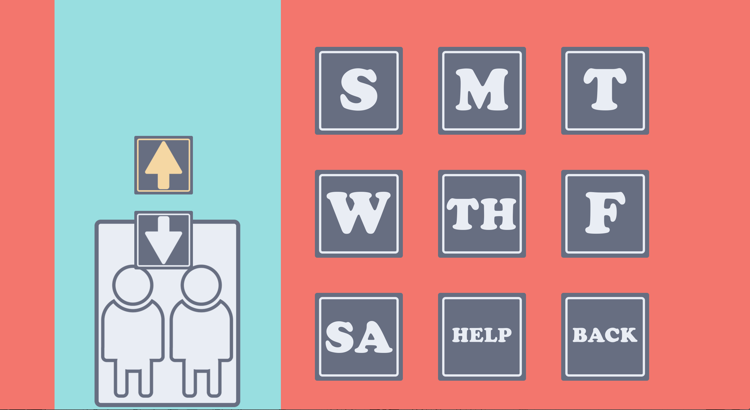
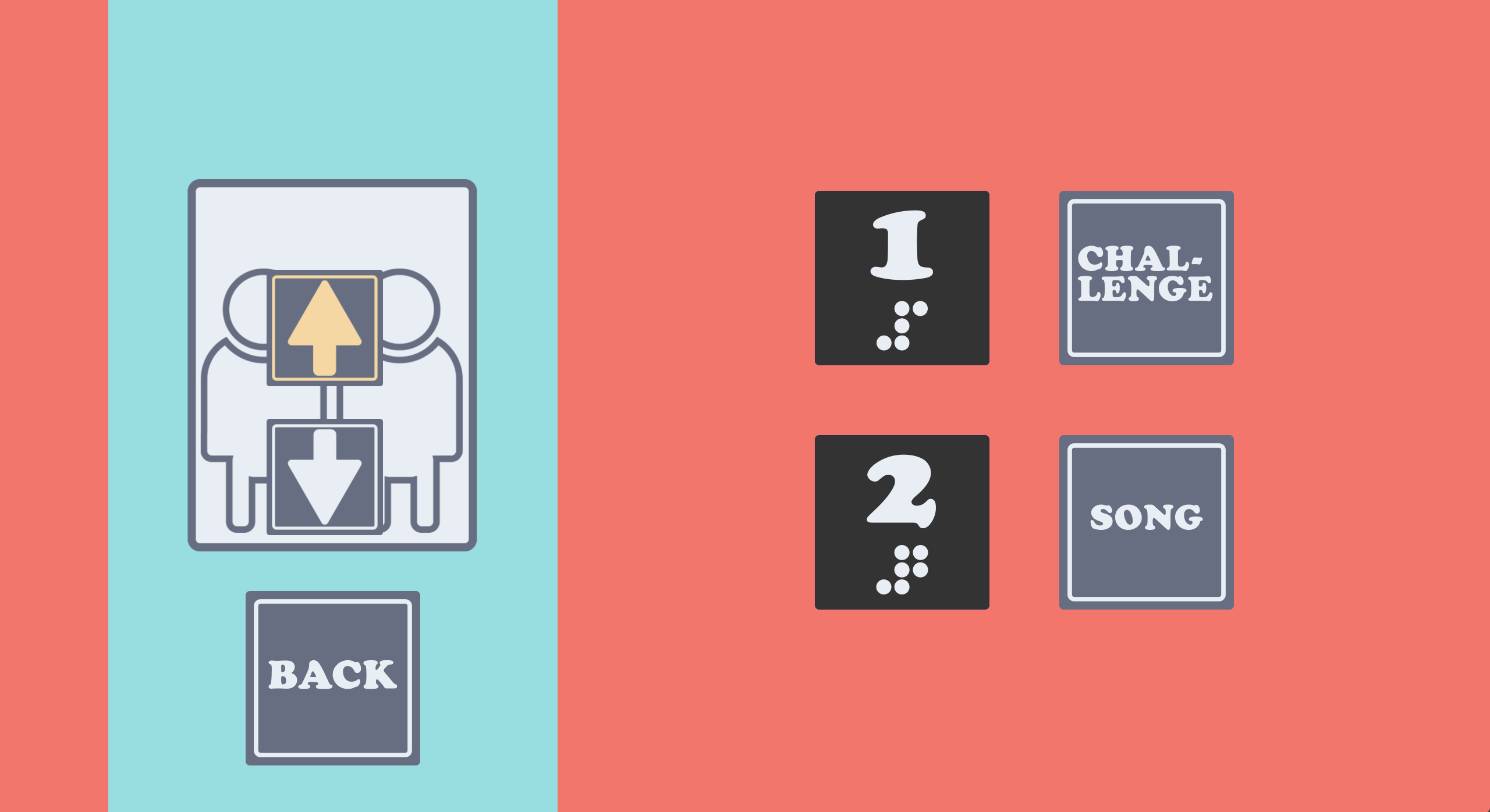
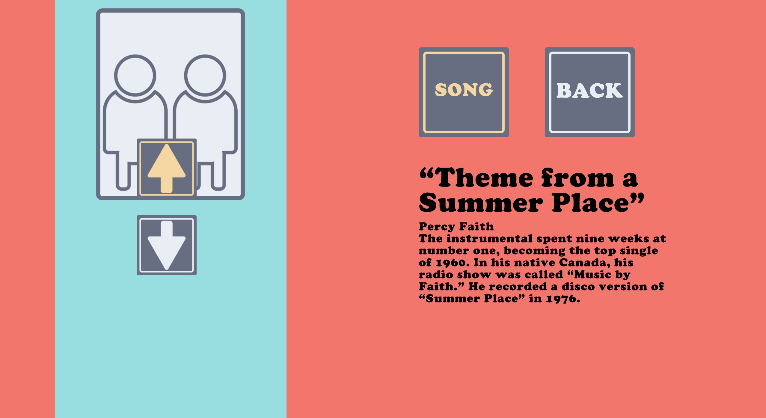
IMPROVEMENTS | I jumped right in to the styling of this website with jquery and css instead of working on establishing my concept and my html wireframe (a lesson I learned from the first project). As a result the first version of this website was very floppy and was mainly form driven. It looked cool, I must say, however it lack substance to it. This final version that you are looking however, though technically-speaking not the most effective way to code a responsive website, has more of a story to tell. My concept for this one was to create a game for people to be playing with eachother in the elevator to ease off the silence elevator awkwardness. After finish coding this however, I think some of the task I asked people to do in the game might make riding an elevator even more awkward! haha
