05/10/2017
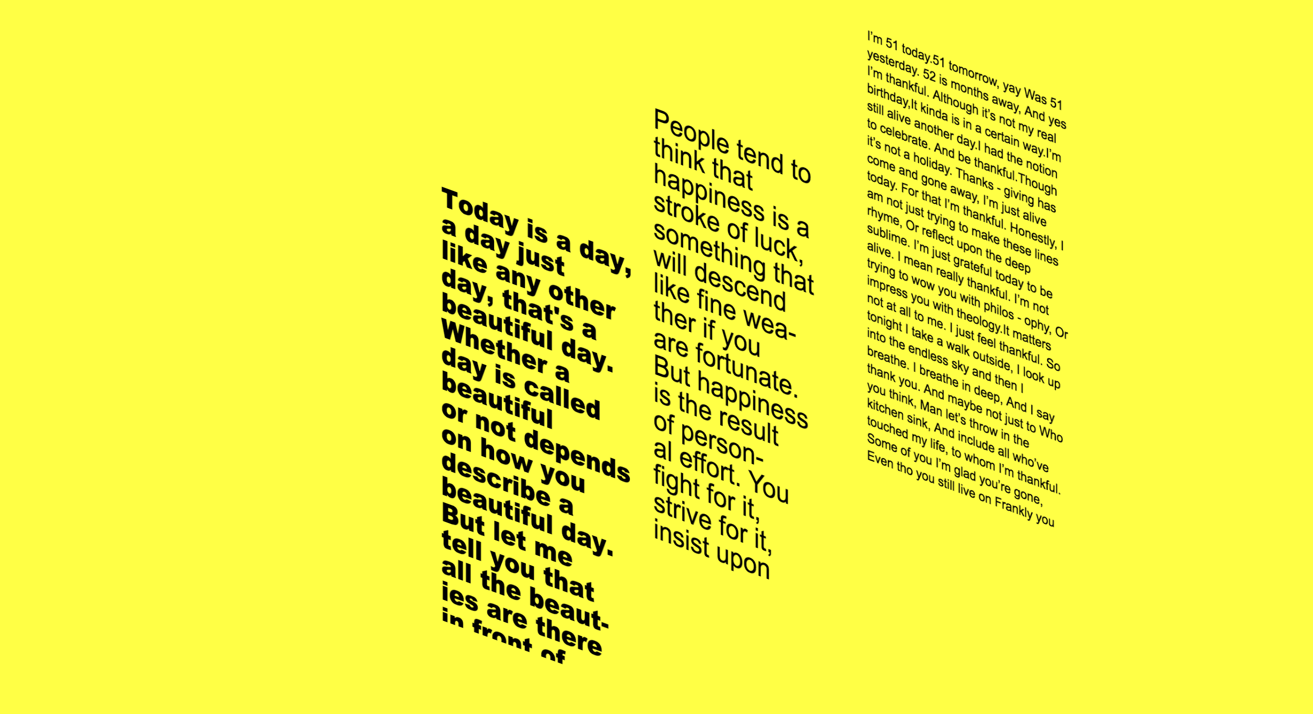
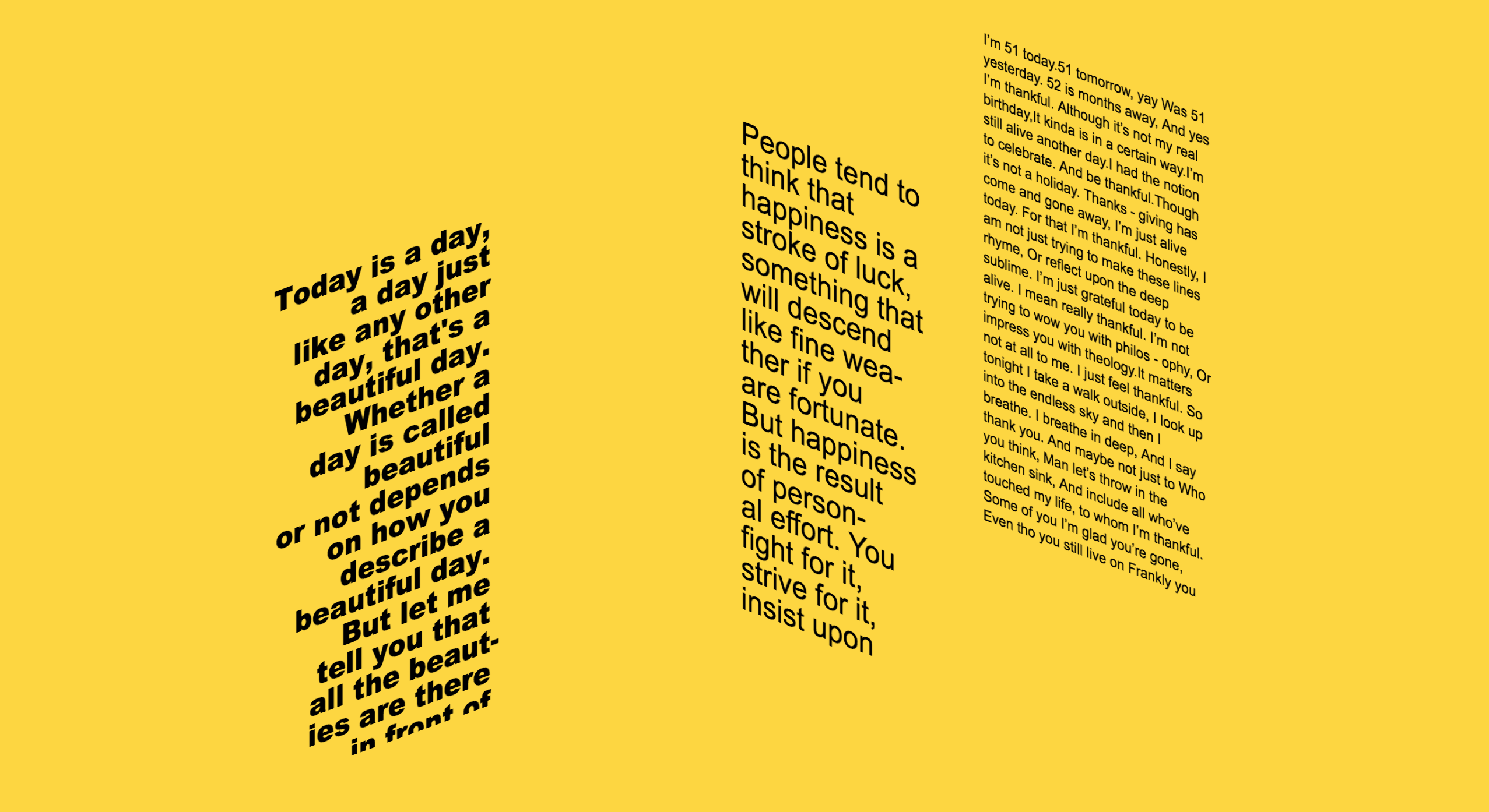
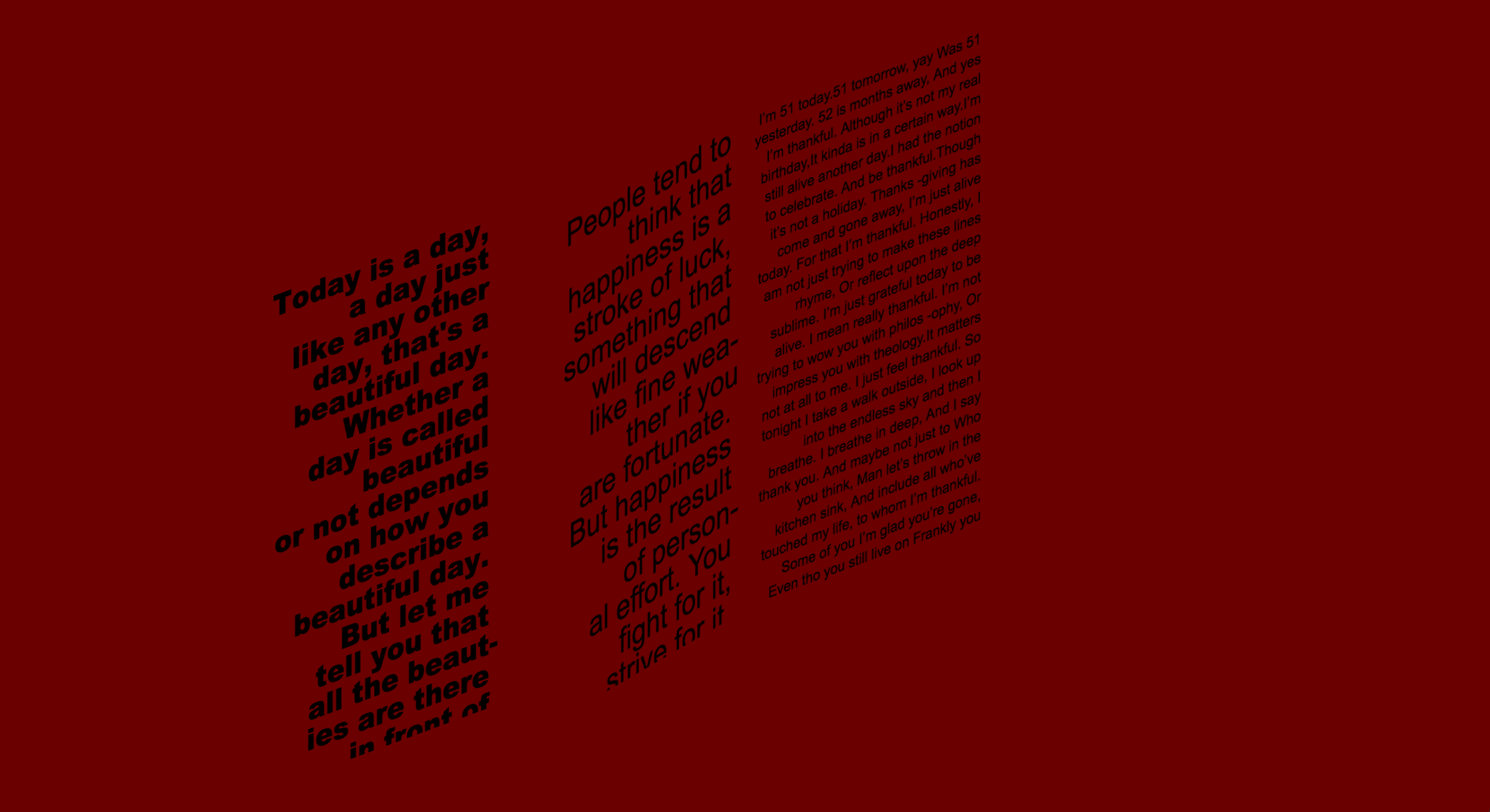
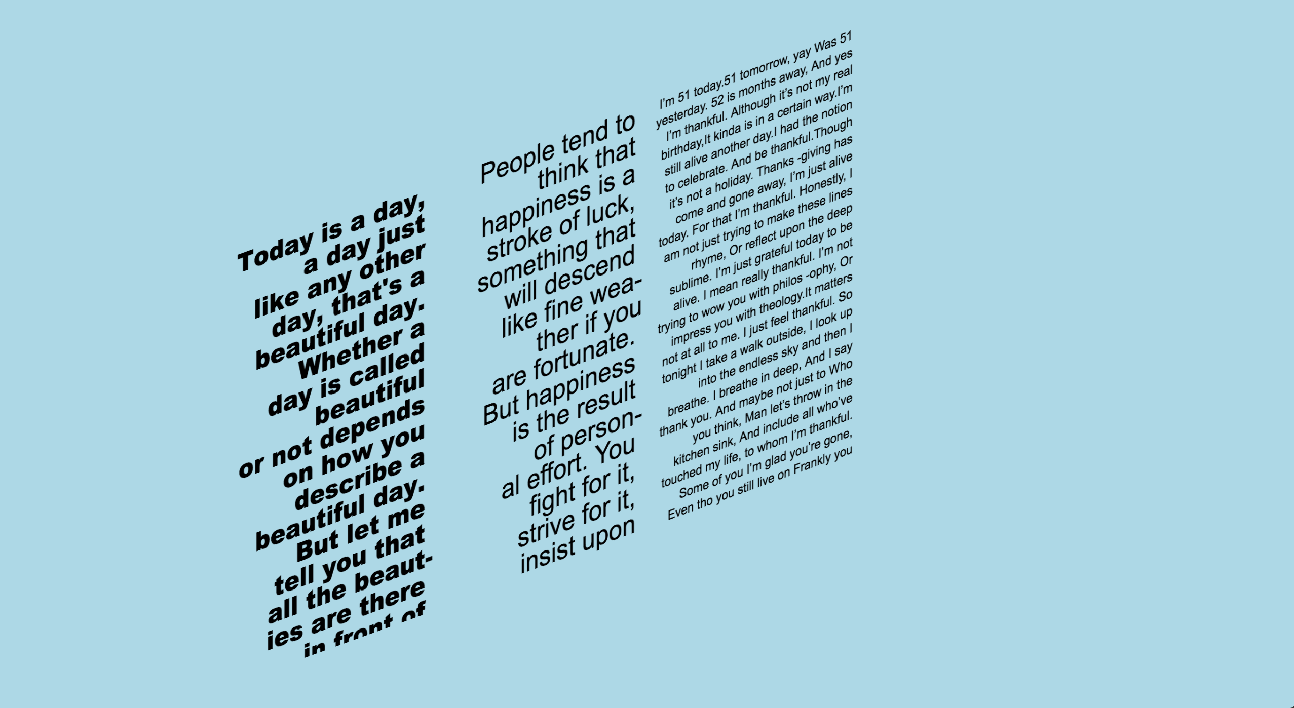
This is our very final projects! It is a project that deals with JSON and Weather API. Our goal is to create a website that changes depending on the weather. For my take, I decided to use the metaphore of window or door and weather. When it is cold, we would shut the door/window and when it's warm we would open the door/window. For me, cold weather being 15 celcius or lower and hot water being above 15 celcius. There is no inbetween state. I was trying to make a point that there really is no such thing as bad weather (there is, but since we can't control it, why stress about it?) and that there is always somethiing you can do to make things better, like opening the window when it's hot and enjoy the sun. I add another layer to this by creating a juxtaposition element. If you open the window in the cold, you will be uncomfortable (I conveyed this using color and motion), vice versa, if you shut all your windows in the summer then you would suffer from the heat. The website is intended to be heart-warming and sending the message that the weather (and life in general) is what it is and that we are better off enjoy the nature and resisting it by openin the window in the cold, or shutting the door when it's hot! Last but not least, inside all the windows/doors there are different inspirational quote, this is meant to make the design even more light-hearted.
LESSONS | Getting JSON to work and connecting the website to Weather API was a pain. Nobody really understood what we had to do, which was deeply fustrating as we all have this dreams and visions, but we could never actually executed. Eventually after many explaination from Michael and Tiff, it just clicked! Patience is truly the key. It was also so exciting to connect our website to and outside resources, this really reinforces a proud feeling in us (exactly what we needed in the finals exam period) that we are actually making progress in coding, that our skills can be connected to the outside world and not just in our classroom settings.
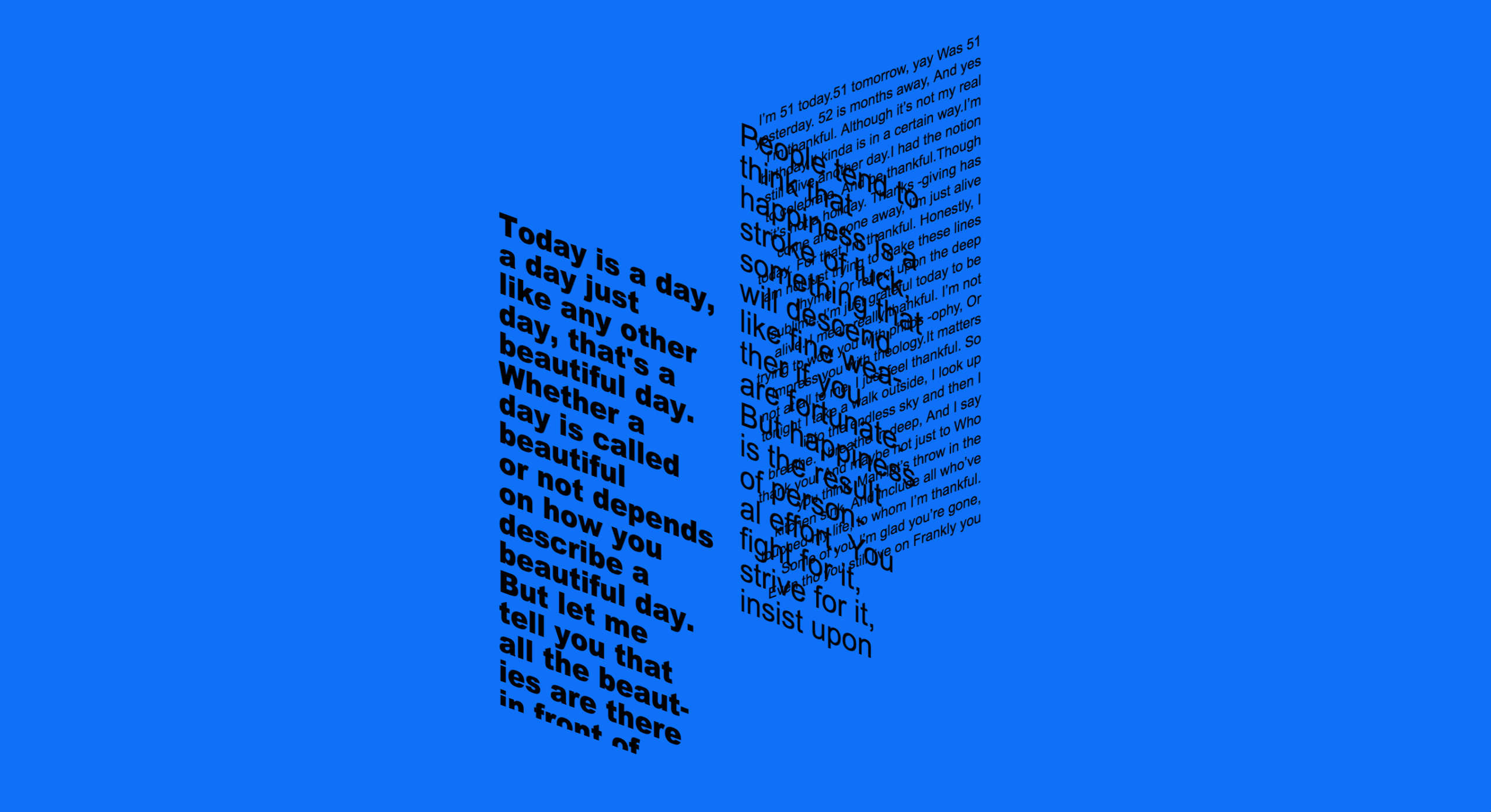
IMPROVEMENTS | Type's readibility is being challenged in this project. As you hover on the text, its shear style would increase on a deeper level, putting readibility into question. Were the poems meant to be read was were they just for decoration? The answer is yes and no. All the poems are not meant to be read thoroughly, I just put it there to compliment and allude to the feeling of gratfullness we should have with life and not just weather. That being said if I were to make this clearer in the future, I would definitely revisit the typography and add more interaction element to it like having the weather react to rain and wind and not just the temperature!
